Iron ore comes out of the ground mixed with impurities, mostly silica. A flotation plant separates the two. The ore is fed in as a pulp, treated with starch and amina, and air is pushed through the mixture so the valuable material rises with the froth and is skimmed off.
The obvious question to ask of a plant like this is what makes the iron purer. The obvious question turns out to be the wrong one, and the reason why is the most useful thing in the data.
This analysis uses six months of real operating data from a Brazilian flotation plant, published on Kaggle as Quality Prediction in a Mining Process. It covers March to September 2017 and records 737,453 readings across 24 columns.
The data does not say what it appears to say
Three things had to be established before any analysis was worth running.
The record is not continuous. Every column reports a full 737,453 values with no nulls, which looks like a complete dataset. It is not. Recording stops on 16 March and does not resume until 29 March. The file holds 4,097 distinct hours where an unbroken six-month record would hold roughly 4,400.
No null check reveals this, because the missing hours are not blank rows. They were never written. March is represented by 209 hours across ten calendar days, so any monthly summary of March describes about a third of the period it claims to cover.
Two of the seven flotation columns behave differently from the rest. Five of the air flow sensors show standard deviations near 29, ranging from roughly 175 to 375. Columns 04 and 05 show standard deviations of 2.6 and 3.6 and never fall below 286 across the entire dataset.
They are not frozen. Aggregated to hourly, they produce 3,571 and 3,605 distinct values against 4,000 to 4,067 for the others. All seven vary. But two of them carry roughly a tenth of the variation of the rest, which limits how much they can explain in any comparison.
Starch flow drops to near zero intermittently. Its minimum reading is 0.002 against a mean near 2,869. These readings appear on 164 separate dates spread across the full six months rather than clustering, which is consistent with intermittent sensor dropouts or brief low-flow periods rather than a shutdown. They account for only 0.54% of rows, but they fall inside 1,111 of the 4,097 hours, so more than a quarter of hourly averages contain at least one.
Two measurement rates in one table
The single most consequential feature of this dataset is easy to miss.
Almost every hour contains exactly 180 readings, one every 20 seconds. Within a single hour, ore pulp pH takes 180 distinct values. Iron concentrate takes one, repeated across every row.
The quality figures are hourly laboratory results, copied across the hour they belong to. Correlating them against 20-second sensor data compares 24 real measurements per day against roughly 4,300 padded rows. The duplication carries no information, and any correlation computed at that resolution is unreliable.
Averaging every sensor to one value per hour puts both sides of the comparison on the same footing. That step is a precondition for analysing this dataset, not an optional refinement. Everything below runs on 4,097 hourly rows.
Why iron purity is the wrong thing to study
Iron concentrate and silica concentrate move by almost exactly the same absolute amount. Their standard deviations are 1.118 and 1.125.
Relative to their own averages they are nothing alike.
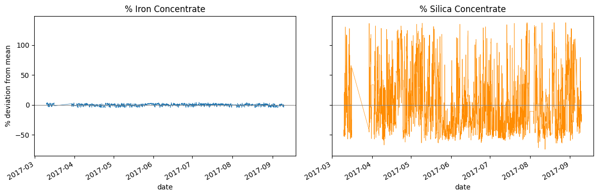
Iron averages 65.05% and varies by 1.7% around that figure. Silica averages 2.33% and varies by 48.3%. Plotted as deviation from their own means on a shared axis, iron is a flat line and silica is a wall of noise.
That flat line is the plant doing its job. Iron purity is held close to a target and stays there, which is exactly what a well-run operation should produce. But a variable that barely moves is a poor subject for analysis, because there is very little variation to account for. Silica, sitting on a much smaller base and free to move, is the more sensitive indicator of how the process is actually performing.
The two correlate at -0.80, which explains about 64% of their shared linear variation and leaves substantial movement in silica that a simple linear relationship with iron does not capture.
The straight diagonal near the start of both charts is the thirteen-day recording gap, drawn as a connecting line rather than a break.
One variable points the wrong way
With silica as the target and everything at hourly resolution, the relationships are weak but consistent in direction.
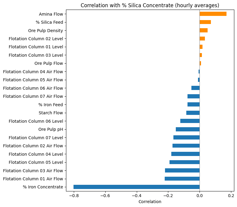
Air flow on columns 01 and 03 sits near -0.22. Froth levels fall between -0.12 and -0.19. Ore pulp pH is -0.15. All negative: more of each goes with less impurity, which is what the process is designed to do.
One variable breaks the pattern. Amina flow correlates at +0.17, the largest positive value in the set.
Amina is the reagent dosed specifically to strip impurities away. More of it should mean less silica, not more.
Testing which way the relationship runs
A correlation has no direction, but time does. If amina drives silica down, dosing now should predict silica later. If something else is going on, that test will fail.
Comparing current amina flow against silica in subsequent hours, the correlation declines from 0.145 at one hour to 0.052 at six. Amina now tells you progressively less about silica later.
Reversing the comparison strengthens it. Silica measured one hour earlier correlates with current amina flow at 0.194, two hours earlier at 0.230, and three hours earlier at 0.255, before weakening at six and twelve hours.
The relationship is strongest when silica leads amina by roughly three hours, and it peaks there rather than staying flat. That shape is what a delayed response looks like.
This timing is consistent with reactive dosing: silica rises, the change is registered, and amina is increased a few hours later. If that reading is right, the plant is correcting after the bad product has already been made, and reagent is being spent on a problem rather than ahead of one.
What this does and does not show
These correlations are weak. A value of 0.255 accounts for only a small share of the variation in amina flow, so this is a signal worth investigating rather than a settled conclusion.
The analysis also shows only that one measurement tends to follow another in time, which is not the same as showing that one causes the other. Delayed laboratory reporting, process residence time, or a shared underlying process factor could produce the same pattern. Confirming the interpretation would require operator logs showing when dosing decisions were actually made.
The lag calculations run on a complete hourly timeline rather than on row positions, so the hour before the March gap is not treated as adjacent to the hour after it. That correction changed each figure by less than 0.001, but it removes the ambiguity.
Where this would go next
The useful follow-up is a leading indicator: a sensor reading that shifts before silica does, early enough to act on. If dosing is genuinely reactive with a two to three hour delay, then anything that reliably moves first is worth more to the plant than any of the correlations reported here.
That is a different analysis from this one, and it needs the plant's own records to do properly.
The full notebook
Analysis built in Python with pandas and matplotlib. The full notebook, including every step of the audit, is published alongside this page.
Data: Quality Prediction in a Mining Process, Kaggle (Eduardo Magalhães Oliveira).
Follow the work
Every project here is written up in full, and AZIMUTH ships in public with a phase-by-phase build log. Connect on LinkedIn to catch new posts, or reach out any time. Always happy to talk data.