Like many people nowadays, I use food delivery apps regularly, maybe even too often. So, when I came across a real dataset from a food delivery company as part of my data analytics bootcamp, I knew immediately that this was a project I would enjoy. What makes it special is that this is not a made-up classroom exercise; it is a modified version of an actual case study that DoorDash gives candidates during their hiring process.
As a data enthusiast, I always wonder about the hows and whys of everything. For this one, my questions were simple: who are these customers? What are they buying? Do people spend more the more they earn? And do marketing campaigns actually work?
Key Findings (TL;DR)
- Income explains 67% of the variation in customer spending.
- Wine and meat drive most revenue.
- No campaign achieved both high reach and high spending at the same time.
- The best customers don't rely on discounts.
For this analysis, I chose Excel, a tool used by virtually every company on the planet and the perfect foundation before moving into more advanced tools.
Quick note: the dataset is from iFood, the Brazilian equivalent of DoorDash, publicly available on GitHub with over 2,000 rows of real customer data, slightly modified for educational purposes.
The Dataset
The dataset used in this analysis originally contained 2,205 customer records and 36 variables, covering everything from income and age to purchasing behavior and marketing campaign responses.
Before diving into the analysis, the data required some preparation. I removed the duplicate records, reducing the 2,205 rows to 2,021 clean records. I also created four new columns, including a unique Customer ID, percentage of income spent, age groups, and month joined, bringing the total to 40 variables. The cleaned dataset was then used as the foundation for all analysis that follows.
The analysis involved data cleaning, exploratory data analysis, correlation analysis, and data visualization to understand customer behavior and marketing performance.
The Analysis
Does Income Predict Spending?
The first question I wanted to answer was simple: Does earning more money mean spending more on food delivery? To find out, I plotted income against total spend for all 2,021 customers.
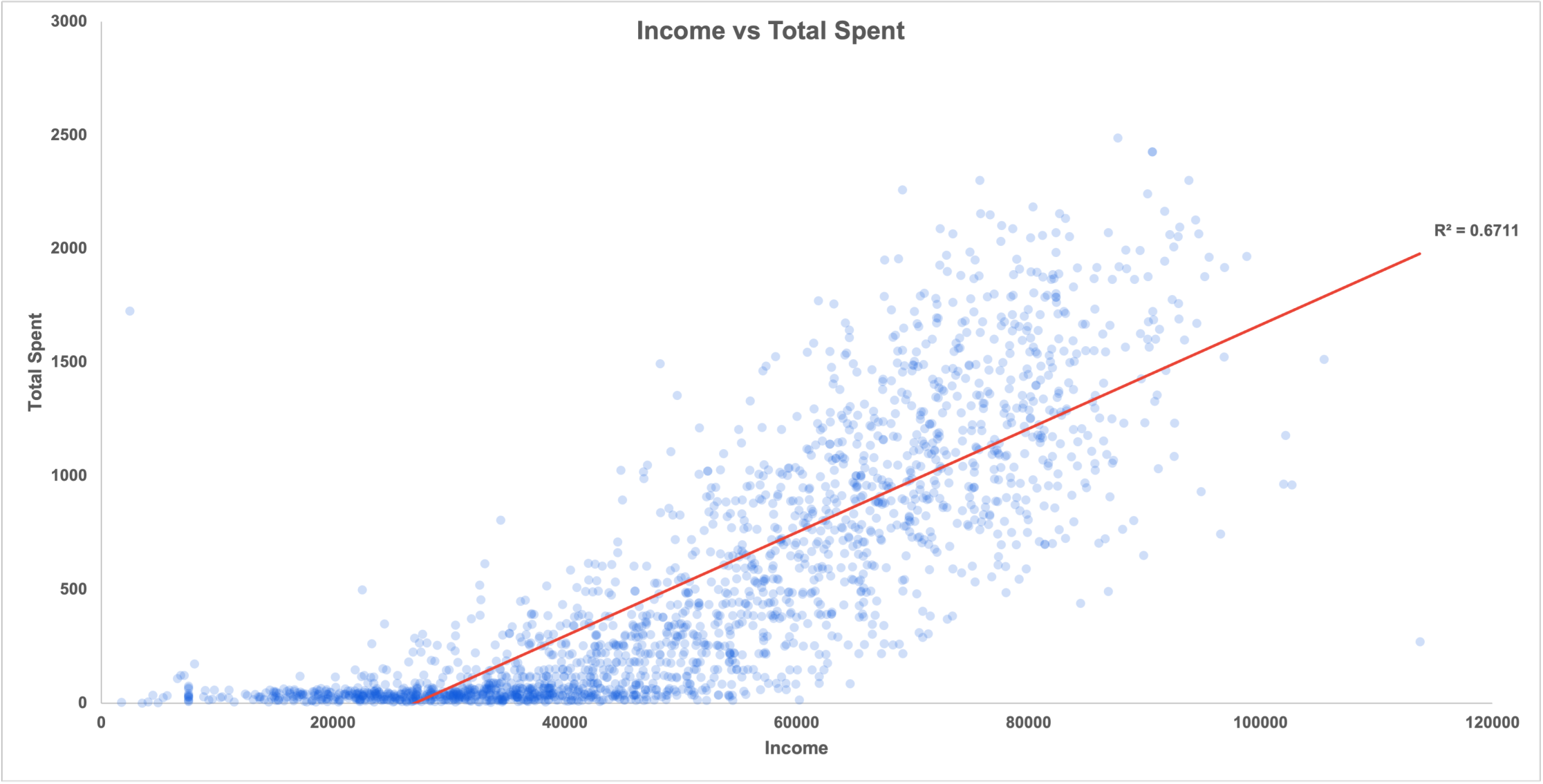
The result was clear. I added a trendline to the chart, along with an R-squared value of 0.67. For those unfamiliar with R-squared, think of it as a score between 0 and 1 that measures how much of the variation in one variable a model explains using the other. At 0.67, income explains approximately 67% of the observed variation in customer spending, and since the trendline slope is positive, the relationship between income and spending is a strong positive one.
In plain English: the more someone earns, the more they tend to spend on food delivery. Not a shocking finding, but having the data to quantify that relationship is what turns an assumption into an insight.
One interesting detail worth noting: at higher income levels, the data fans out significantly, meaning high earners vary much more in their spending habits than lower-income customers. Some spend heavily, others barely engage at all. That gap at the top is actually an opportunity worth exploring for any marketing team.
How Are Customers Spending?
Now that we know income drives spending, the next question is: how is that money actually being distributed? Two charts help answer this.
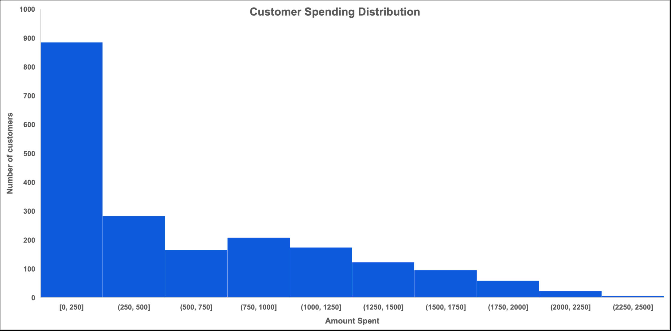
First, looking at the overall spending distribution across all customers, the pattern is heavily skewed towards the lower end. Nearly 900 out of 2,021 customers spent under $254 in total. The numbers drop off steadily from there, with only a small group of high-value customers spending over $1,500. This is a classic pattern in retail and food delivery data, where a small percentage of customers generate a disproportionate amount of revenue.
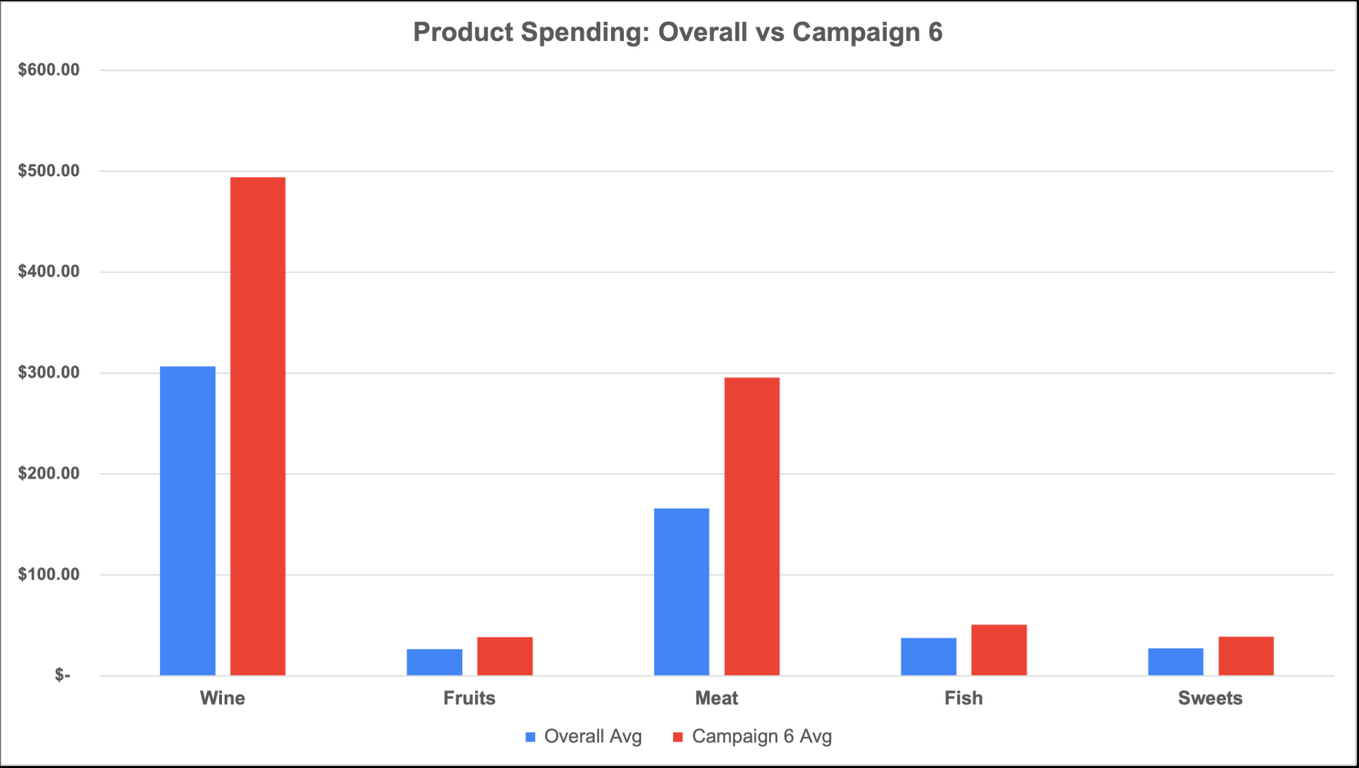
Second, when breaking down spending by product category, one thing becomes immediately clear: wine and meat dominate everything else. The average customer spent $306 on wine and $166 on meat, dwarfing every other category. Fruits, sweets, fish, and other products all came in well under $50 on average.
For any marketing team, this is actionable. The majority of revenue comes from two categories and a small group of high-spending customers. Protecting and growing that segment should be the priority.
Which Campaign Actually Worked?
This is where things get really interesting. The company ran 6 marketing campaigns across its customer base. Looking at the results, no single campaign managed to achieve both high reach and high average spend at the same time, and that tension is exactly where the business opportunity lies.
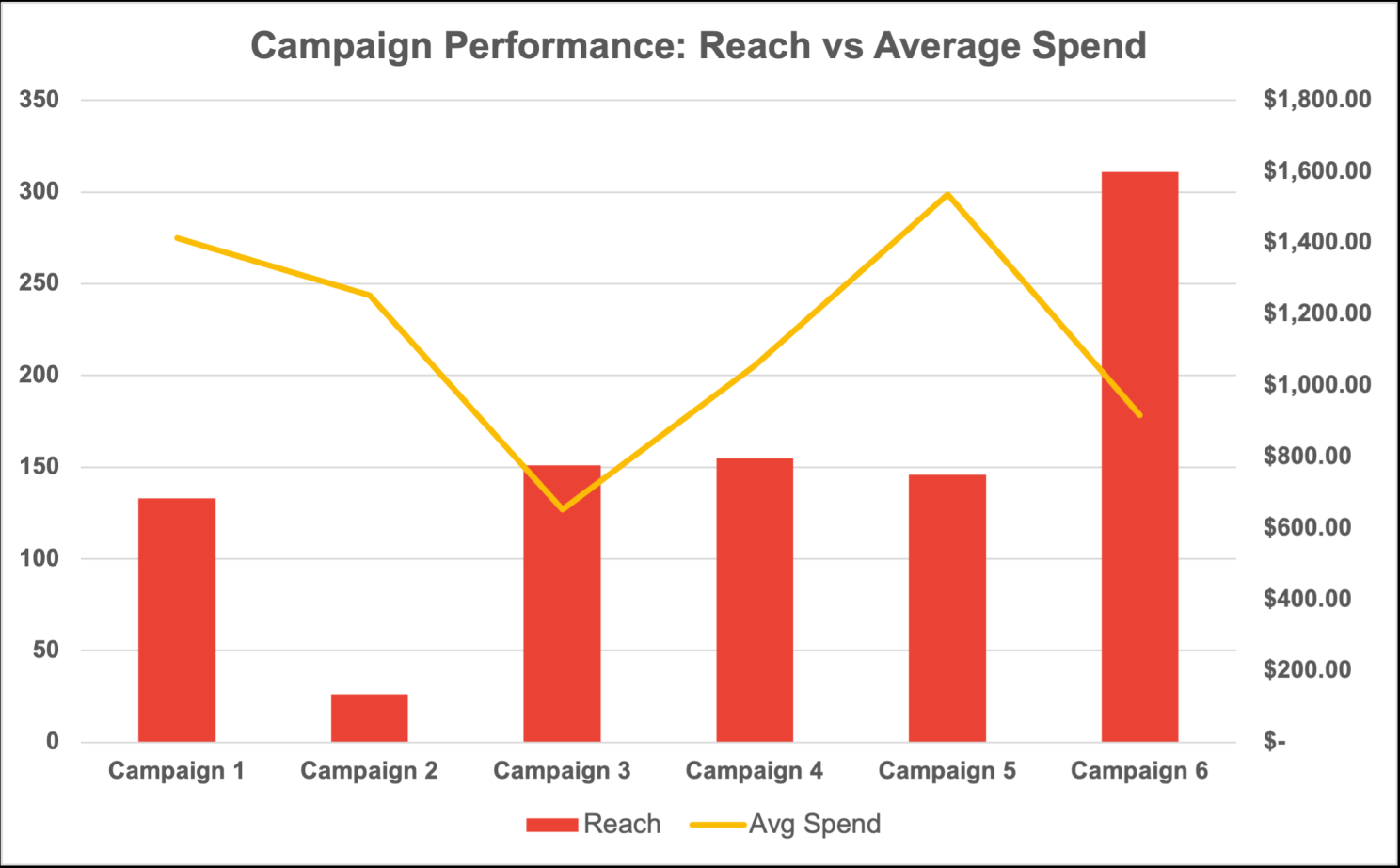
Campaign 6 reached the most customers by far with 311 buyers, more than double any other campaign. However, its average spend of $917 was not the highest. That title belongs to Campaign 5, which attracted customers who spent an average of $1,537 but reached only 146 people.
On the other end of the spectrum, Campaign 3 is worth flagging. It reached 151 customers but had the lowest average spend of all six campaigns at just $652. High reach, low value, a combination that should raise questions about who that campaign was targeting and whether the offer was attracting the wrong audience.
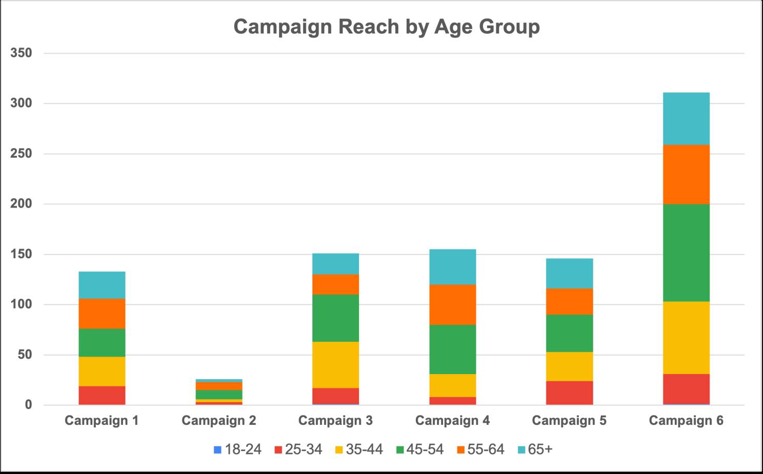
Digging deeper into Campaign 6 specifically, the age group breakdown reveals exactly who responded. The 45 to 54 age group dominated with 97 buyers, followed by the 35 to 44 age group with 72. Together, those two groups accounted for 54% of all Campaign 6 conversions. Notably, the 18- to 24-year-old group was virtually absent, with only 1 customer responding.
The recommendation here is clear: Campaign 6 found the right audience in terms of volume. The next step would be testing Campaign 5's offer with Campaign 6's distribution strategy to see if we can get both high reach and high spend at the same time.
How Are Customers Buying?
The final piece of the puzzle was understanding how customers actually make their purchases. Are they browsing the app without buying? Are they deal hunters waiting for discounts? Or are they decisive buyers who know what they want?
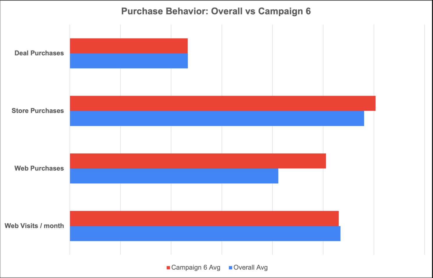
Looking at the data, a few things stand out. Campaign 6 customers visit the app almost exactly as often as the average customer, 5.3 visits per month versus 5.3 overall. However, they make significantly more web purchases, averaging 5.1 per customer compared to 4.1 overall. That is a 23% higher conversion rate from the same amount of browsing.
Store purchases also showed a slight increase for Campaign 6 customers, 6.0 versus 5.8 overall.
Perhaps the most telling finding is around deal purchases. Campaign 6 customers used deals at a rate virtually identical to the average customer's, at approximately 2.33. They are not bargain hunters. They are not waiting for discounts to make a decision. They browse the same amount as everyone else, they just convert more and spend more when they do.
That is the profile of a high-quality customer segment. They are decisive, engaged, and do not need discounts to buy.
What Did I Learn?
After analyzing over 2,000 customer records, four key takeaways stand out.
First, income is the strongest predictor of spending. With an R² of 0.67, knowing a customer's income level gives a meaningful head start in predicting their value to the business.
Second, wine and meat drive the majority of revenue. Any campaign or promotion strategy that does not account for these two categories is leaving money on the table.
Third, Campaign 6 reached the most people but not the highest spenders. The 35 to 54 age group is the core audience and should be the primary target for future campaigns.
Fourth, the best customers are not deal hunters. They are decisive buyers who convert at higher rates without needing discounts. Rewarding them with quality and convenience rather than promotions is likely the smarter long-term strategy.
Follow the work
Every project here is written up in full, and AZIMUTH ships in public with a phase-by-phase build log. Connect on LinkedIn to catch new posts, or reach out any time. Always happy to talk data.